The Insider App
Quick and effective solution for those who have career needs

Overview
Background
Two of my friends and I began this business venture together. At the time, I had recently completed my master's degree and was uncertain of how to reach my career aspirations.
Fortunately, my two partners possessed over a decade of experience in the field and have been invaluable in guiding me toward success. This is a common experience for recent graduates and those transitioning between careers, but those with prior experience can offer valuable solutions to these challenges.
Role
Founder & Product designer
Duration
Dec 2019 - Apr 2020
Team
Two founders from Business and Tech background
Tools
Figma, Photoshop, Illustrator, Zeplin
Problem and solution
Problem
Nowadays, people always have career needs, and the current solutions may not be timely, accurate, and effective. How can we design an App to provide quick and precise career advice to someone in need?
Solution
From research to implementation, I designed an App to provide a career talk between those in need and an expert who already have field experience, with those features:
-
One to one
-
45 minutes
-
Real person
-
Online
Competitor Research
We started our research with competitor research with its provisional personas to understand what the market looks like and how our customers might be benefited from it. Our choices of competitors may not have to be a specific business. They can also be a method that people use to reach specific goals.

Insights
After a comprehensive research of competitors, we found
Most career services focus on long-term career development, not for time-sensitive cases
The choice of mentors are very limited or highly focused on one area
The quality of the conversation is not satisfying, or hard to control
Customer Research
Survey
I have surveyed to grasp a basic understanding of career services needs. Eighteen respondents are between 18 - 31 years old. Here are the most remarkable results of the survey.


Based on the survey findings, we have noticed the following:
-
A large gap between "I want to get a career service" and "I really do get a career service"
-
Users are not very satisfied with their career services results
Interview
To find out the reasons for the remarkable results of the survey and to dig deeper into customers' motivations, pain points, happy moments, and anticipations, we conducted interviews with 8 of the survey participants.
"I don't find most career services can solve my urgent problems, so I don't have the desire to use it."
"Cold calls are frustrating and sometimes embarrassing. I prefer not to do it."
"There are specific people I want to talk to, but I don't know how to connect or talk with them."
"The conversation is not always useful. Sometimes we talked for 30 minutes but still didn't solve my problems."
Insights and goals
Insights
-
Connection to the right mentor is highly valued by customers but poorly provided by current career services.
-
The conversations are often of bad quality and not productive.
-
Many urgent needs exist, but most career services fail to provide in-time guidance.
Goals
Provide abundant mentor resources that cover different topics, companies, and areas.
Provide timely career services to solve users' urgent needs and problems.
Provide high-quality conversation between customers and mentors.
User Empathy
In order to design an app that meets the needs of our users, we have put ourselves in their shoes and created user personas and customer journey maps for two typical user profiles.


Information Architecture
Goals.
By this point, I have a clearer and more detailed understanding of the critical business and user/customer goals and where they overlap. Identifying and keeping these goals in mind as I moved on to ideation and design was important.
BUSINESS
-
Enable customers to get a quick and accurate understanding of an industry.
-
Provide a broad choice of industries.
-
Grow a batch of loyal customers who will use it frequently and recommend it to friends.
-
Provide experienced mentors.
-
A user-centric design to enable users to get what they want.
-
Focus on career service for the first stage, and extend to life & interest area in the future.
CUSTOMERS
-
Get a quick and accurate understanding of an industry.
-
Have a wide variety of industries to choose from.
-
Have timely urgent services.
-
Get professional guidance to meet their career goal.
-
Access to experienced mentors.
-
Clean navigation within the App.
SHARED GOALS
-
Enable customers to get a quick and accurate understanding of an industry.
-
Provide a wide variety of industries.
-
Provide experienced mentors.
-
Provide timely urgent services.
-
A customer-centric and easy-to-navigate design.
Primary features.
Once we established our shared goals, we identified the key features of the Insider App.:
-
Browse different topics
-
Browse different mentors
-
Make reservation
-
Cancel/change reservation
-
Make comments on previous reservations
-
Personal profile
-
Search topics/mentors
-
Share a specific issue with friends
User flow.
Next, with a clear understanding of the user journey, shared goals, and the primary features we should have, we identified the basic user flow of the Insider App to simulate the process that users encounter the InsidervApp.

Basic sitemap.
Now we have a solid understanding of the primary features and how users interact with the Insider App. I have also done secondary research to reference how other Apps have structured some standard sections, like Reservations, Settings, etc.
After all that, I created a basic version of a sitemap to present all the features in an organized way.

Low fidelity prototyping
We want the users to test the structure to see if it meets their expectations and is easy to use. So, I have created a low-fidelity prototype with Figma. Due to the constraint of time, I only created pages with the main functions and showcased the user flow here.


Testing
With my initial wireframes, I created a low-fidelity prototype for usability testing. To ensure the prototype is user-friendly, I define the objectives and tasks for users to complete.
Tasks
-
Sign in
-
Search for the topic
-
Make reservation
-
Modify reservation
-
Browse mentor information
-
Find help & support
Objectives
-
Whether people can navigate through the App smoothly
-
Identify their frustrations
-
Identify their satisfaction
-
Identify their expectations for the App that I might have missed
Results
A total of 5 participants tested the prototype. All tasks had a 100% completion rate.
But the error-free rates for browsing mentor information and finding help & support are below 50%, which means I need to iterate on those screens to improve usability.
Interivew
After users had tested the prototype, I conducted one-on-one interviews with each of them to learn more about their feelings, expectations, disappointment, and suggestions for the overall structure and usability of the Insider App. And to see whether I can get some inspiration from them.
Here are the findings.

Iterating
After the prototype testing and interview, we have decided to make some modifications to meet users' expectations and to make Insider App more user-friendly.
-
Function wise:
-
A more prominent display of the mentor section.
-
A more prominent display of the help & support section.
-
-
Structure wise:
-
Add a company section to the main navigation.
-
Move the settings section to the header bar.
-
Redesign the header bar. Move all the functions to the header bar.
-
Combine the splash page with the login page.
-
Redesign the main page.
-
-
Aesthetic wise:
-
Move the subject to the center of the page to avoid confusion with the go-back arrow.
-
Add white space between each section.
-
A complete sitemap.
With all the changes being made, I have now finished with a complete App site map.

A complete low fidelity prototype.

Branding and UI
From Insider side
-
Clean, to feature the main functions.
-
Professional, as Insider focuses on career services.
-
Light, as most of the customers are pretty young.
A mood board
I created a mood board to collect visual design inspiration for the app and to convey the overall look & feel I decided to go for.

Color palette and the font
After a few rounds of test-out, we have decided to use this color palette and font for the Insider App.
Blue can give people a professional and calm feeling for the color palette, which is reasonable for a career services App. And most of our users are pretty young. The orange can cater to the young age and give hope to job hunting. Last but not least, the black series is very useful for micro copying, which is easy to read and clear to see.
For the font, I chose Avenir. Avenir draws inspiration from the typeface ‘Futura.’ The designer wanted to improve the Futura font and add a more human feel. It has an easy and clean feel, which provides readability for a small screen setting. And it’s simple and crisp and brings more human and modern to our Insider App.

Meet Insider
Splash Screen
During the prototype testing phase, many users have reminded us that Insider is a relatively new service, and we need a significant amount of introduction and explanation to let people understand what Insider's service is.
We have created four splash screens: mentors at your hand; anytime, anywhere; A broad range of topics; Be ready for challenges now. All of the splash screens help the user understand how Insider can be helpful to them.
If they don't like it, they can always choose to "skip this" to go to the main page.


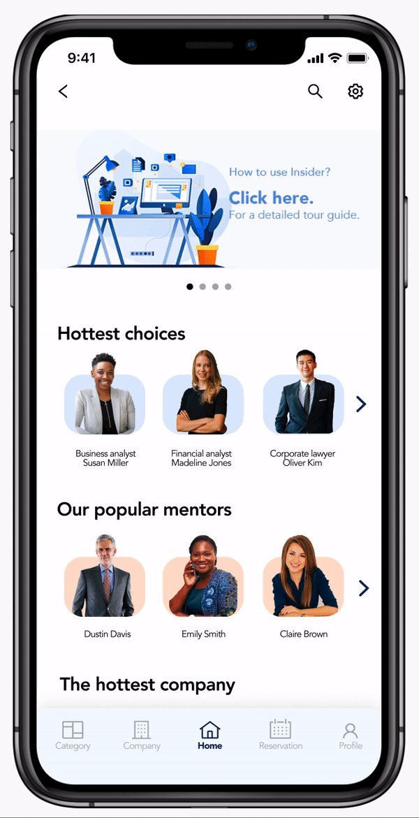
Home Screen
The home screen is where users get the first impression of us, and it's also the place where people find aggregated functions.
Based on our first-round research, users' most significant pain points are qualitative conversations and the right mentors. So, we put the hottest topic and mentors on top of the main page. Also, we considered users to have interview needs, so we added a company category.
Based on our second-round research, we also saved a banner area to insert Insider user guidance.
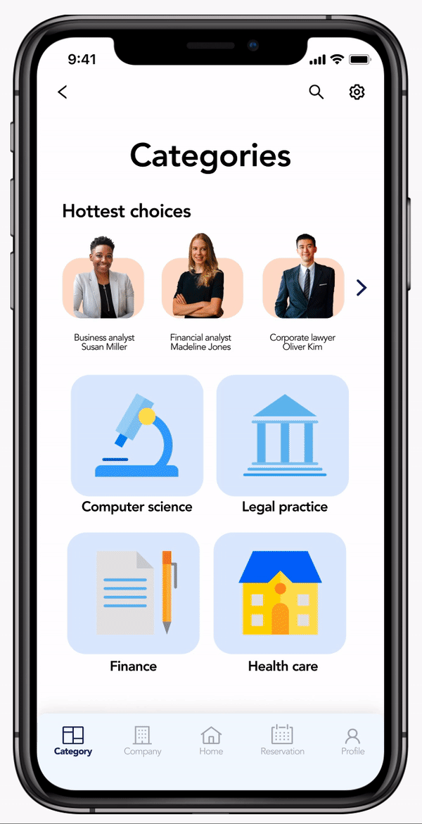
Category
The category is where users can search for their topics.
In the research, users showed considerable interest in mentors and time urgent, so we put the hottest topic on every page to give users quick access to the topic they want.
Although we won't have many mentors in the first place, we will have a lot in the future. So, we have put many sub-categories under the main category to help users locate their target.
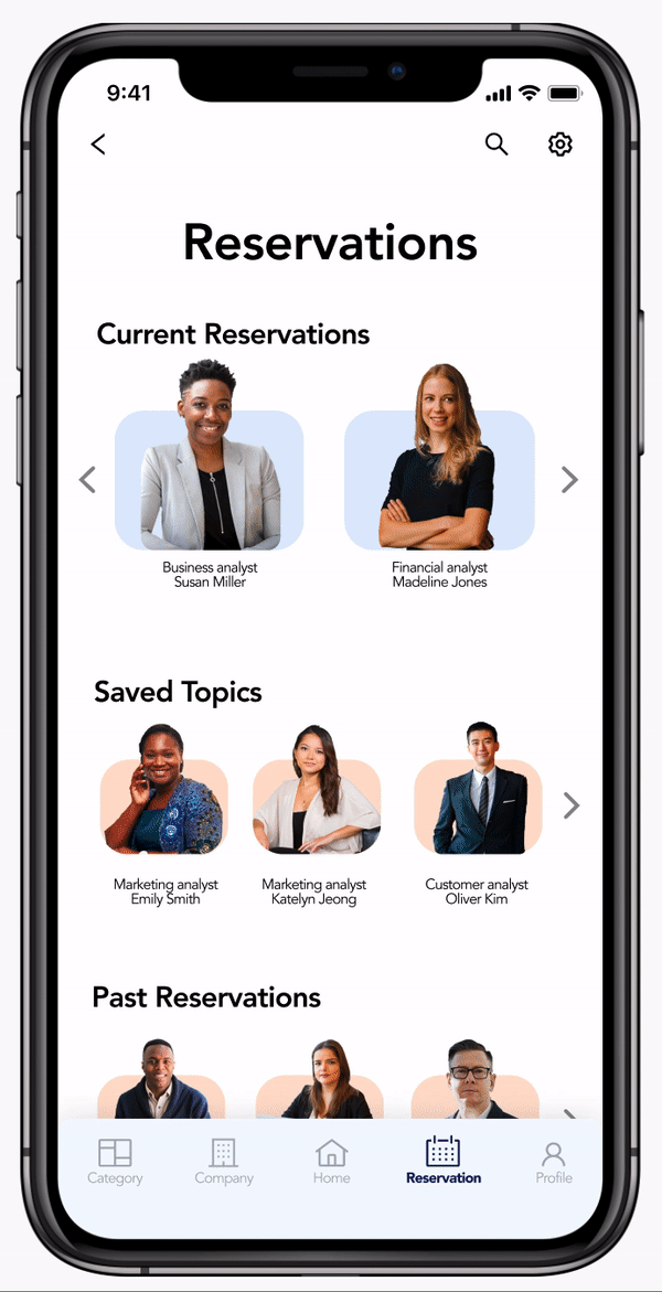
Reservation
On the reservation page, we offered users choices of current reservations, saved topics, past reservations, and recommendations.
For the design of this section, we mainly referenced the secondary research of other Apps. Also, we always put the recommendation section there to give users easy access to the topics.
Final Prototype
Next steps
-
This version:
-
Give the prototype to engineers to realize the App launch.
-
-
Next version:
-
Add a shopping cart function to let customers store & buy a few sessions together.
-
Add a mentor application function to let customers apply for mentors.
-
-
Insider future moves:
-
Design the corresponding website.
-
Design the mentor version of the Insider App.
-
What I have learned
Enjoy the overwhelming feeling.
It's my first time entirely in charge of building a complete App.
The learning curve is sharp. There are always more possibilities coming up when we are designing. Adding one more function means the complexity can increase ten times more. Along the way, I have grown a lot in terms of user research, logical thinking, and the ability ... to stay calm. It was so much fun riding along.
Embrace the change.
Things will never go just as we planned.
As we have saved the final version of the low-fi prototype and moved on to the UI part, maybe one of the founders has some new ideas, and we have to go back to the prototype again. It isn't delightful sometimes, but we should reiterate can produce good products.
The courage to make choices.
Although sometimes we all know the best way to present a feature. It might not be the most efficient way if we consider the investment of time and workforce. It is hard, but we are designing for a business, and efficiency is very, very important to a business.